Logo Development Branding | Brand Philosophy | Brochure Marketing POPs | Ecom Website & Digital Identity
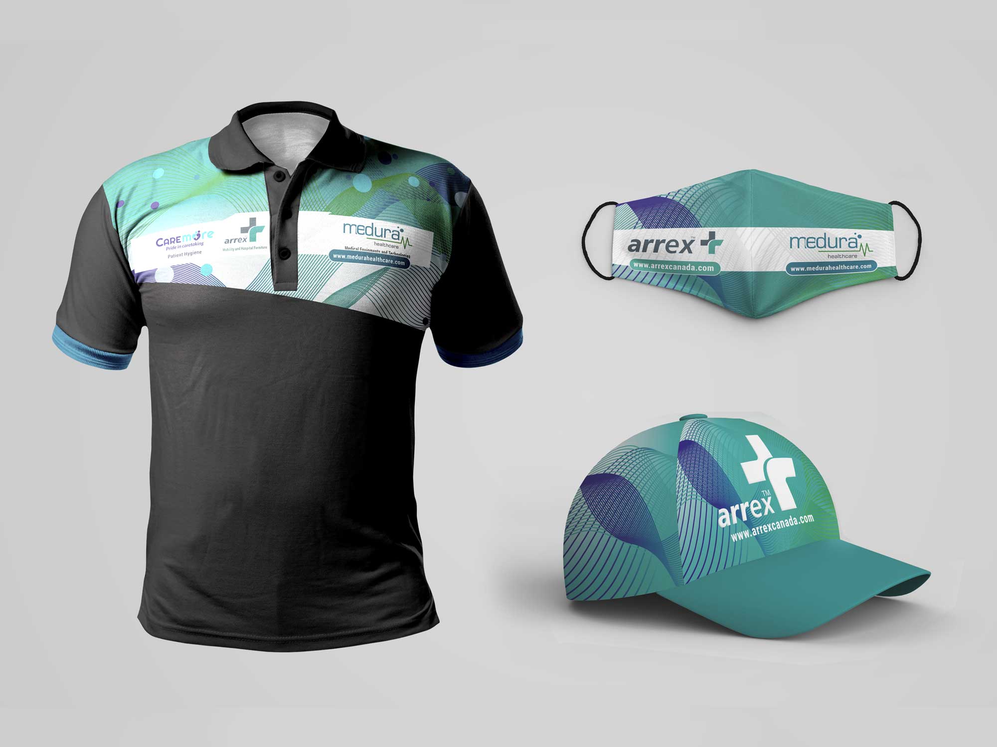
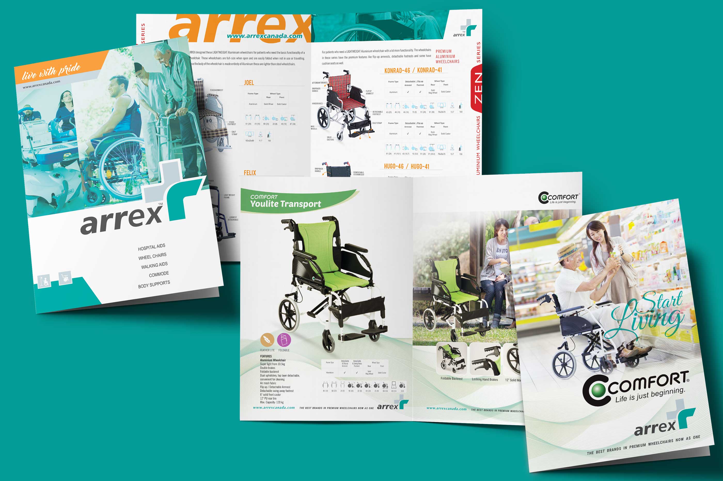
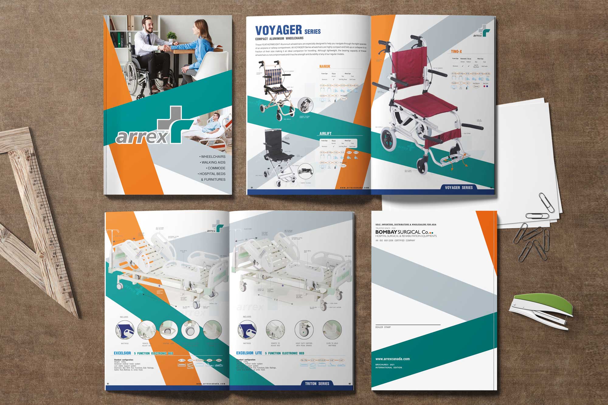
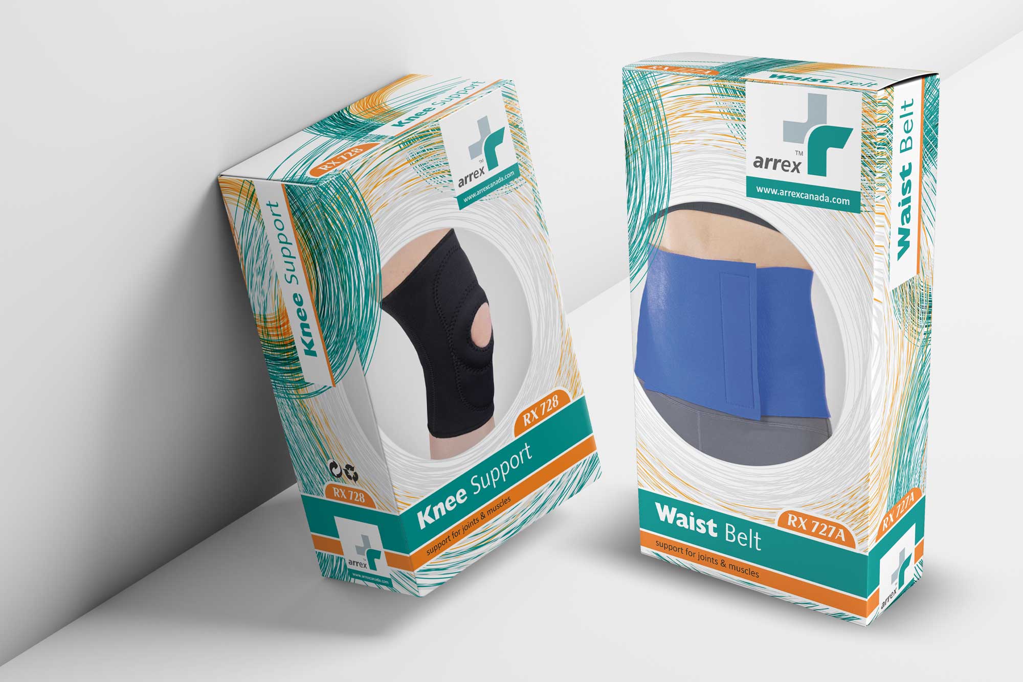
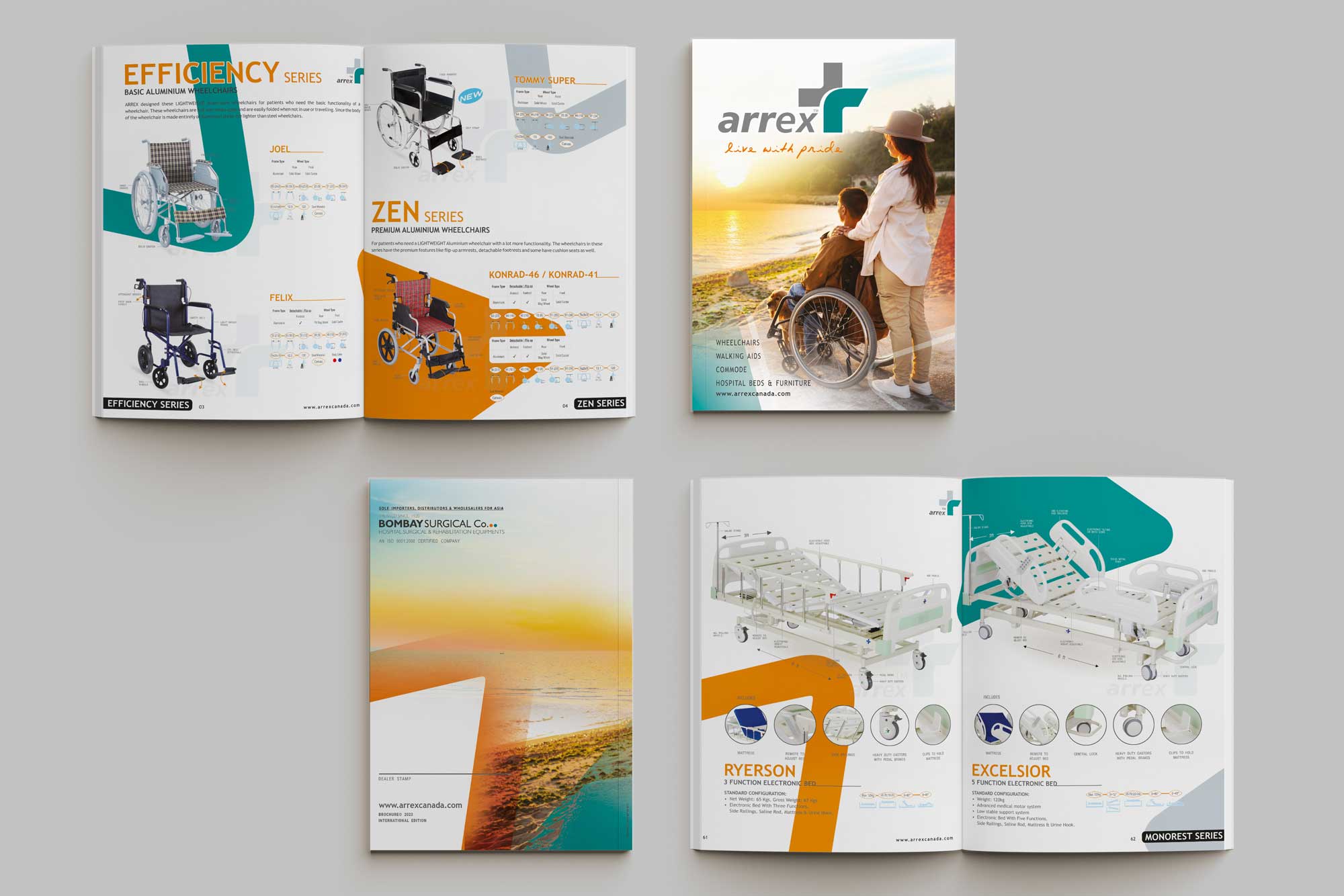
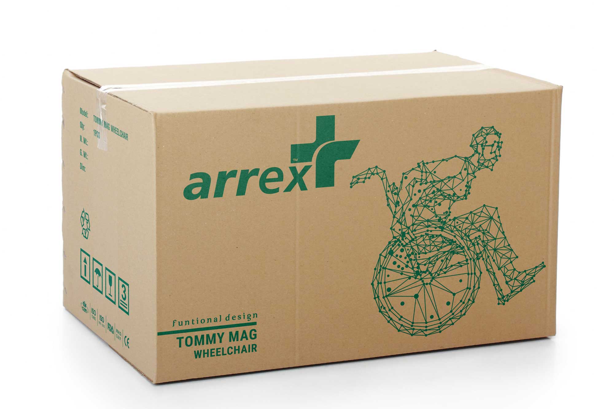
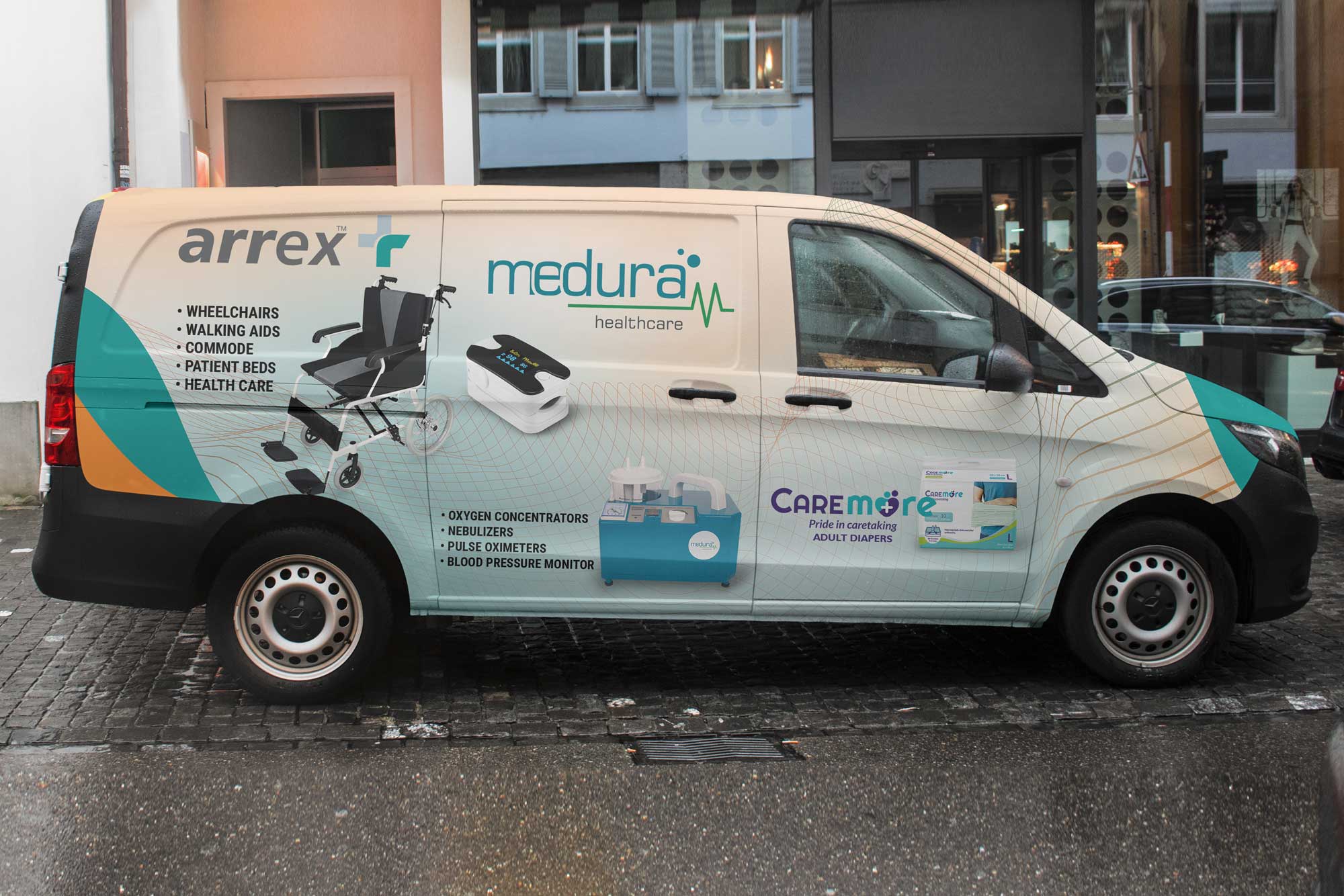
The brand mark evolved from RX to ARREX, introduced with a refreshed color system to signal a bold entry into the retail and e-commerce landscape. This strategic repositioning called for a holistic branding refresh—ensuring clarity and consistency across all marketing touchpoints, from meticulously crafted brochures to a sleek e-commerce website. The overarching goal: to present ARREX as a symbol of premium quality and elevate its consumer appeal.